Street signs are perhaps the most obnoxious, useless and expensive form of political advertising around. As many politicos often say, “Signs don’t vote”. So why do we see so many of them every year? Because no one wants to be the one candidate without any signs.
However in a politically contentious and highly charged atmosphere as we currently have, we could all use something a bit light-hearted and non-serious. So with that in mind, let’s review the street signs of Scottsdale city council candidates and see who stands out.
Solange Whitehead
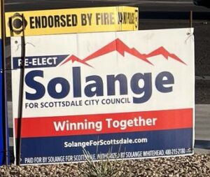 We love this. Red and blue on white, with both subtle Americana and bipartisan tones. Combined with “Winning Together” as a slogan, it is meant to appeal to everyone without pandering. Combined with the mountain background and use of the first name instead of the last, I fear that we’re starting out with the best one.
Grade: A
Barry Graham
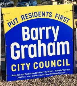
This pic doesn’t seem to do justice to the yellow on top, which contrasts well against the bright blue. A reasonable slogan on there as well. That said, the weird blue dome design doesn’t make much sense from a design perspective. Not bad, but not spectacular.
Grade: B-
Kathy Littlefield
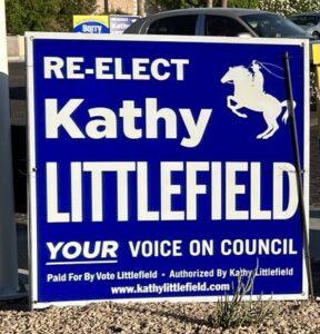
Any political consultant will tell you that two or more colors make for significantly more expensive signs than monochromatic ones, and that likely played into Littlefield’s choice. The horse is a nice touch of Scottsdale lore. The simplicity doesn’t really stick out too much, but it is a clean, wholly acceptable design.
Grade: B-
Tim Stratton
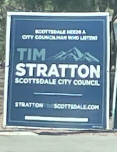
We like the two hues of blue…very sharp. The iconic mountains are also a nice touch, as are the differing colors of the URL. We would prefer a shorter, punchier slogan for a sign, but all in all, not bad.
Grade: B+
Raoul Zubia
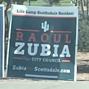
Rarely do you find anything in street signs that is new, but that is a new color scheme for us, and we’re here for it. A saguaro is a bit tired when it comes to iconography, and I’m not sure that “Life Long Scottsdale Resident” is an impactful slogan.
Grade: B-
Pamela Carter
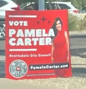
We’re not against having pictures in street signs, especially if you’re physically attractive, but the red on red is not a good choice. We have no idea what those starbursts are towards the top, the name of the seat is too small, and is that a QR code in the bottom left? No one’s going to look that up while parked. An A for effort, but when it comes to execution?
Grade: C-
Dan Ishac

As far as color schemes go…unless you’re promoting the Seattle Seahawks, not ideal. Strange contrast. Looks like an 8th grader could have made this. Uninteresting design, and putting your last name in large print while having your first name in the URL is a marketing misstep. The last name sticks out, which is the only thing keeping this from a failing grade.
Grade: D+
Discover more from Arizona Progress Gazette
Subscribe to get the latest posts sent to your email.